Download This Notebook: Plotting.ipynb
Plotting
Introduction
This tutorial describes skrf’s plotting features. If you would like to use skrf’s matplotlib interface with skrf styling, start with this
[1]:
%matplotlib inline
[2]:
import skrf as rf
Plotting Methods
Plotting functions are implemented as methods of the Network class.
Network.plot_s_reNetwork.plot_s_imNetwork.plot_s_magNetwork.plot_s_db…
Similar methods exist for Impedance (Network.z) and Admittance Parameters (Network.y),
Network.plot_z_reNetwork.plot_z_im…
Network.plot_y_reNetwork.plot_y_im…
Smith Chart
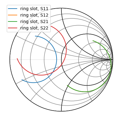
As a first example, load a Network and plot all four s-parameters on the Smith chart.
[3]:
from skrf import Network

ring_slot = Network('data/ring slot.s2p')
ring_slot.plot_s_smith()
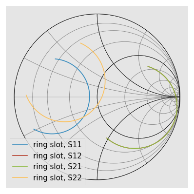
scikit-rf includes a convenient command to make nicer figures quick:
[4]:
rf.stylely()  # nicer looking. Can be configured with different styles
ring_slot.plot_s_smith()
[5]:
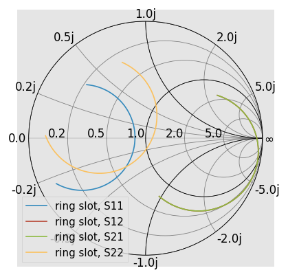
ring_slot.plot_s_smith(draw_labels=True)
Another common option is to draw admittance contours, instead of impedance. This is controlled through the chart_type argument.
[6]:
ring_slot.plot_s_smith(chart_type='y')
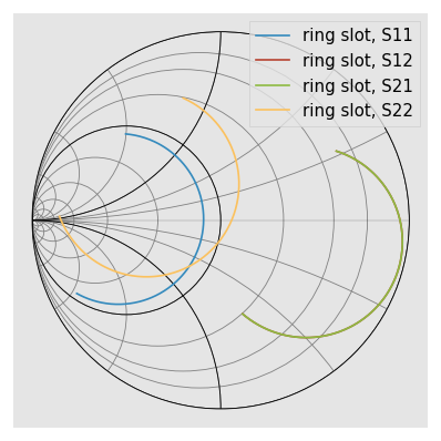
See skrf.plotting.smith() for more info on customizing the Smith Chart.
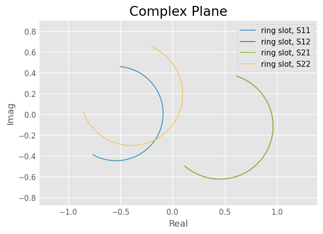
Complex Plane
Network parameters can also be plotted in the complex plane without a Smith Chart through Network.plot_s_complex.
[7]:
ring_slot.plot_s_complex()

from matplotlib import pyplot as plt
plt.axis('equal') # otherwise circles wont be circles
[7]:
(-0.855165798772, 0.963732138327, -0.8760764348472001, 0.9024032182652001)
Log-Magnitude
Scalar components of the complex network parameters can be plotted vs frequency as well. To plot the log-magnitude of the s-parameters vs. frequency,
[8]:
ring_slot.plot_s_db()
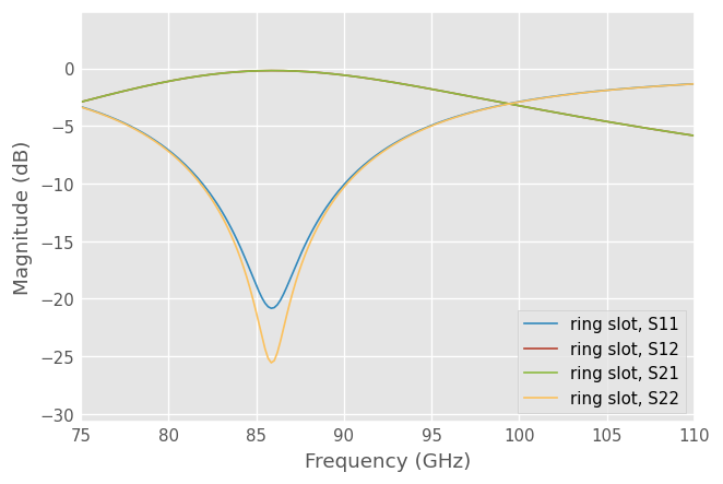
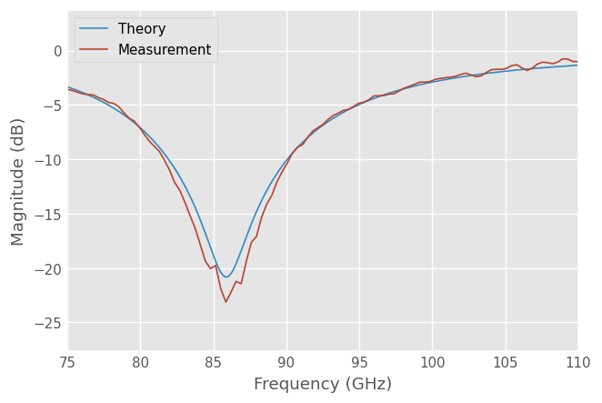
When no arguments are passed to the plotting methods, all parameters are plotted. Single parameters can be plotted by passing indices m and n to the plotting commands (indexing start from 0). Comparing the simulated reflection coefficient off the ring slot to a measurement,
[9]:
from skrf.data import ring_slot_meas
ring_slot.plot_s_db(m=0,n=0, label='Theory')
ring_slot_meas.plot_s_db(m=0,n=0, label='Measurement')
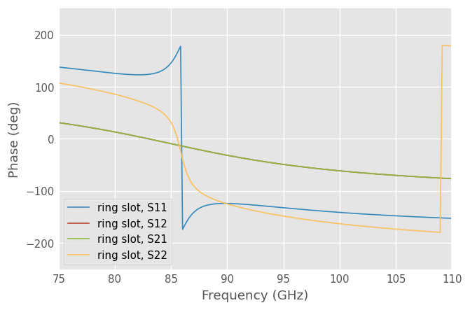
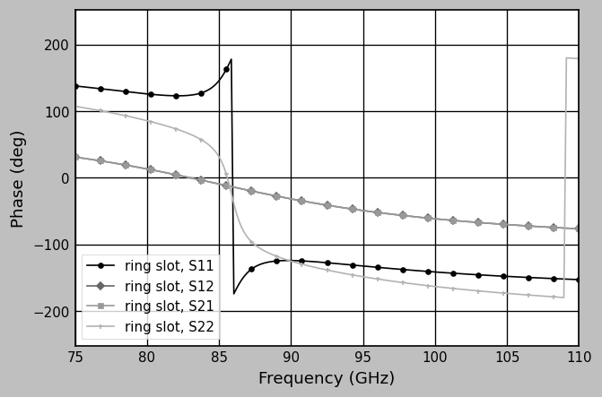
Phase
Plot phase,
[10]:
ring_slot.plot_s_deg()
Or unwrapped phase,
[11]:
ring_slot.plot_s_deg_unwrap()
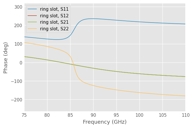
Phase is radian (rad) is also available
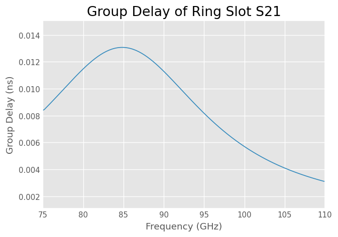
Group Delay
A Network has a plot() method which creates a rectangular plot of the argument vs frequency. This can be used to make plots are arent ‘canned’. For example group delay
[12]:
gd = abs(ring_slot.s21.group_delay) *1e9 # in ns

ring_slot.plot(gd)
plt.ylabel('Group Delay (ns)')
plt.title('Group Delay of Ring Slot S21')
[12]:
Text(0.5, 1.0, 'Group Delay of Ring Slot S21')
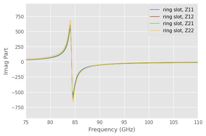
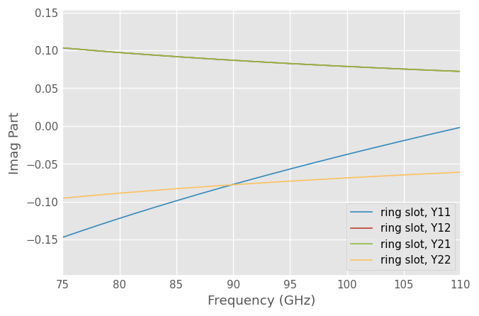
Impedance, Admittance
The components the Impedance and Admittance parameters can be plotted similarly,
[13]:
ring_slot.plot_z_im()
[14]:
ring_slot.plot_y_im()
Customizing Plots
The legend entries are automatically filled in with the Network’s Network.name. The entry can be overridden by passing the label argument to the plot method.
[15]:
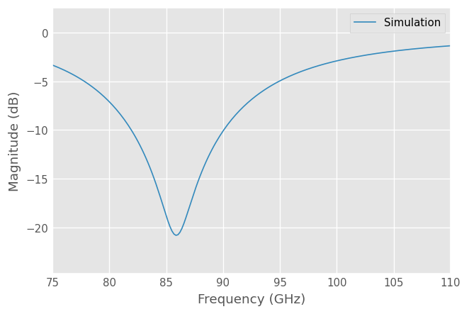
ring_slot.plot_s_db(m=0,n=0, label = 'Simulation')
The frequency unit used on the x-axis is automatically filled in from the Networks Network.frequency.unit attribute. To change the label, change the frequency’s unit.
[16]:
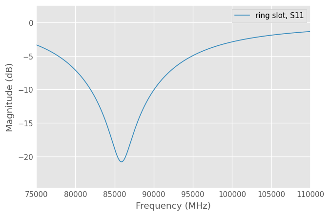
ring_slot.frequency.unit = 'mhz'
ring_slot.plot_s_db(0,0)
Other key word arguments given to the plotting methods are passed through to the matplotlib matplotlib.pyplot.plot function.
[17]:
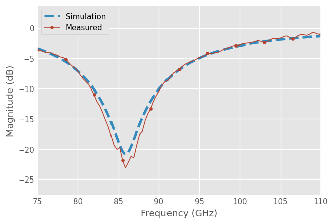
ring_slot.frequency.unit='ghz'
ring_slot.plot_s_db(m=0,n=0, linewidth = 3, linestyle = '--', label = 'Simulation')
ring_slot_meas.plot_s_db(m=0,n=0, marker = 'o', markevery = 10,label = 'Measured')
All components of the plots can be customized through matplotlib functions, and styles can be used with a context manager.
[18]:
from matplotlib import pyplot as plt
from matplotlib import style
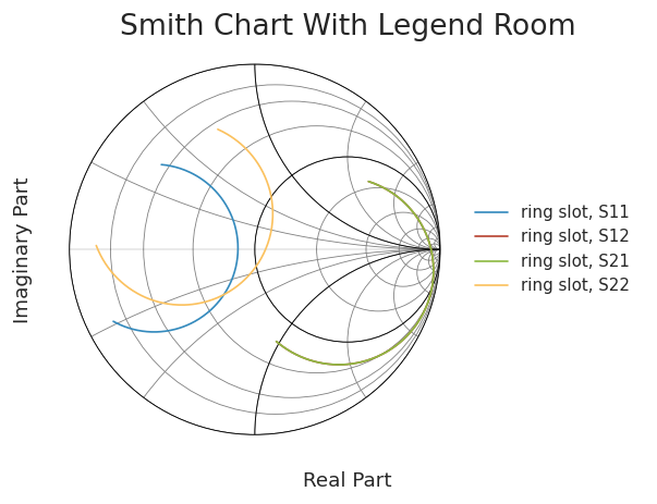
with style.context('seaborn-ticks'):
ring_slot.plot_s_smith()
plt.xlabel('Real Part');
plt.ylabel('Imaginary Part');
plt.title('Smith Chart With Legend Room');
plt.axis([-1.1,2.1,-1.1,1.1])
plt.legend(loc=5)
Saving Plots
Plots can be saved in various file formats using the GUI provided by the matplotlib. However, skrf provides a convenience function, called skrf.plotting.save_all_figs, that allows all open figures to be saved to disk in multiple file formats, with filenames pulled from each figure’s title,
[19]:
from skrf.plotting import save_all_figs
save_all_figs('data/', format=['png','eps','pdf'])
Adding Markers Post Plot
A common need is to make a color plot, interpretable in greyscale print. The skrf.plotting.add_markers_to_lines adds different markers each line in a plots after the plot has been made, which is usually when you remember to add them.
[20]:
from skrf import plotting
with plt.style.context('grayscale'):
    ring_slot.plot_s_deg()
    plotting.add_markers_to_lines()
    plt.legend() # have to re-generate legend
[ ]: